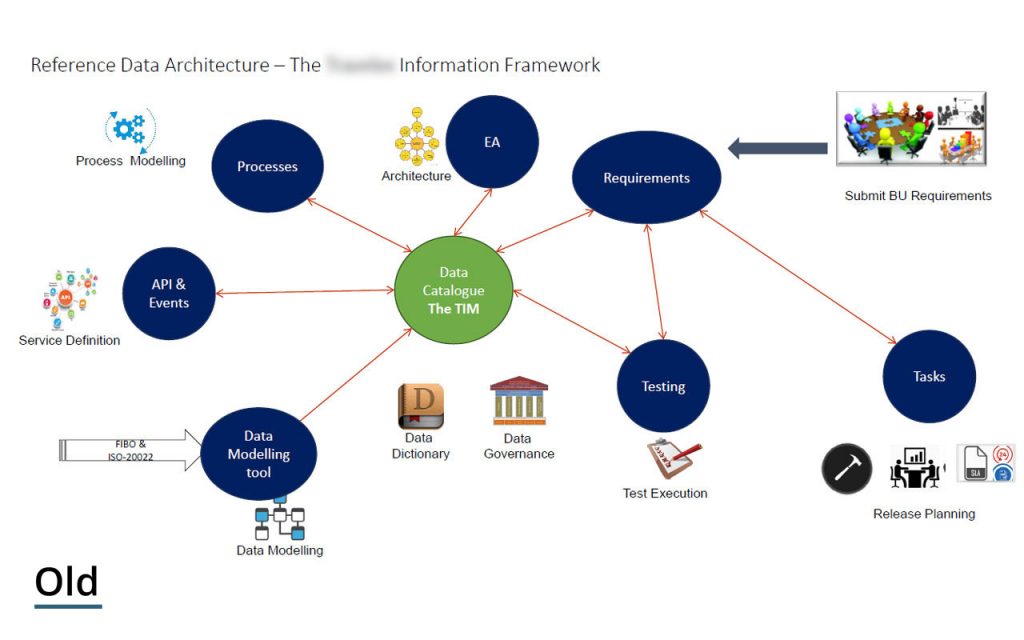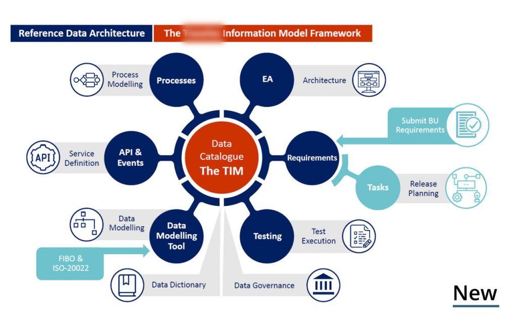

Architecture Diagrams need to be circulated around the business with confidence. These are frameworks that many people within the organisation will follow and use, but can be laid out in ways that are confusing. On the previous diagram, it lacked that look and feel of a professional document. A mixture of fonts not matching that of the business does not give the Diagram a uniform look, and neither do the skew-whiff arrows or text boxes. Images look like they have been pulled from WordArt and the diagram is lacking symmetry to really feel like a premier document that can be circulated with confidence.
The overall look of the diagram has been overhauled to match the clients branding, giving it a look and feel as if was created by the in house team. Suitable colours were used to match the branding and make the diagram much less busy. The diagram now has symmetry, giving it a much more polished look, while text and the boxes they sit in are now uniform. Custom icons were created to modernise the look of the diagram, which is now circulated around the business with confidence.


Konvergent,
The Hoxton, 70 Colombo St,
London,
SE1 8DP
T: +44 (0)20 3744 1256
E: info@konvergent.co.uk
| Cookie | Duration | Description |
|---|---|---|
| cookielawinfo-checkbox-analytics | 11 months | This cookie is set by GDPR Cookie Consent plugin. The cookie is used to store the user consent for the cookies in the category "Analytics". |
| cookielawinfo-checkbox-functional | 11 months | The cookie is set by GDPR cookie consent to record the user consent for the cookies in the category "Functional". |
| cookielawinfo-checkbox-necessary | 11 months | This cookie is set by GDPR Cookie Consent plugin. The cookies is used to store the user consent for the cookies in the category "Necessary". |
| cookielawinfo-checkbox-others | 11 months | This cookie is set by GDPR Cookie Consent plugin. The cookie is used to store the user consent for the cookies in the category "Other. |
| cookielawinfo-checkbox-performance | 11 months | This cookie is set by GDPR Cookie Consent plugin. The cookie is used to store the user consent for the cookies in the category "Performance". |
| viewed_cookie_policy | 11 months | The cookie is set by the GDPR Cookie Consent plugin and is used to store whether or not user has consented to the use of cookies. It does not store any personal data. |