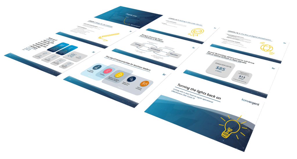
Within technical presentations, you need that “Aha” moment from your audience, where all the blood, sweat and tears into the research and design was realised by your stakeholders. Too often we see presentations and slide decks with a monstrous amount of text and technical information where the presenter will only repeat the text that is shown on screen. Too much data and mundane presenting methods can instantly lead to your audiences attention being directed elsewhere.
As you only have 3 minutes to capture the attention of your audience, eye-catching branding and visuals are required from the offset. Animations are added to the slides to give them some personality, and allow information on screen to be fed to the audience in bitesize chunks. Only key information is kept on the slides, allow the presenter to talk about other relevant points in much more detail. The appendix is used for Architecture diagrams, so not to overwhelm stakeholders and turn them away from any proposals. Data is transformed into infographics rather than static tables, making the numbers behind a proposal much easier to understand.


Konvergent,
The Hoxton, 70 Colombo St,
London,
SE1 8DP
T: +44 (0)20 3744 1256
E: info@konvergent.co.uk
| Cookie | Duration | Description |
|---|---|---|
| cookielawinfo-checkbox-analytics | 11 months | This cookie is set by GDPR Cookie Consent plugin. The cookie is used to store the user consent for the cookies in the category "Analytics". |
| cookielawinfo-checkbox-functional | 11 months | The cookie is set by GDPR cookie consent to record the user consent for the cookies in the category "Functional". |
| cookielawinfo-checkbox-necessary | 11 months | This cookie is set by GDPR Cookie Consent plugin. The cookies is used to store the user consent for the cookies in the category "Necessary". |
| cookielawinfo-checkbox-others | 11 months | This cookie is set by GDPR Cookie Consent plugin. The cookie is used to store the user consent for the cookies in the category "Other. |
| cookielawinfo-checkbox-performance | 11 months | This cookie is set by GDPR Cookie Consent plugin. The cookie is used to store the user consent for the cookies in the category "Performance". |
| viewed_cookie_policy | 11 months | The cookie is set by the GDPR Cookie Consent plugin and is used to store whether or not user has consented to the use of cookies. It does not store any personal data. |